Client: SUNY Oswego Institutional Research Dept
Team: Daisie Bancroft(Data) & Mary Ann Preston(advisor)
Role: Data Visualization Designer, Front-end Developer
Tools/Lang: Java, D3.js, Microsoft Excel
Deliverables: Website
Overview
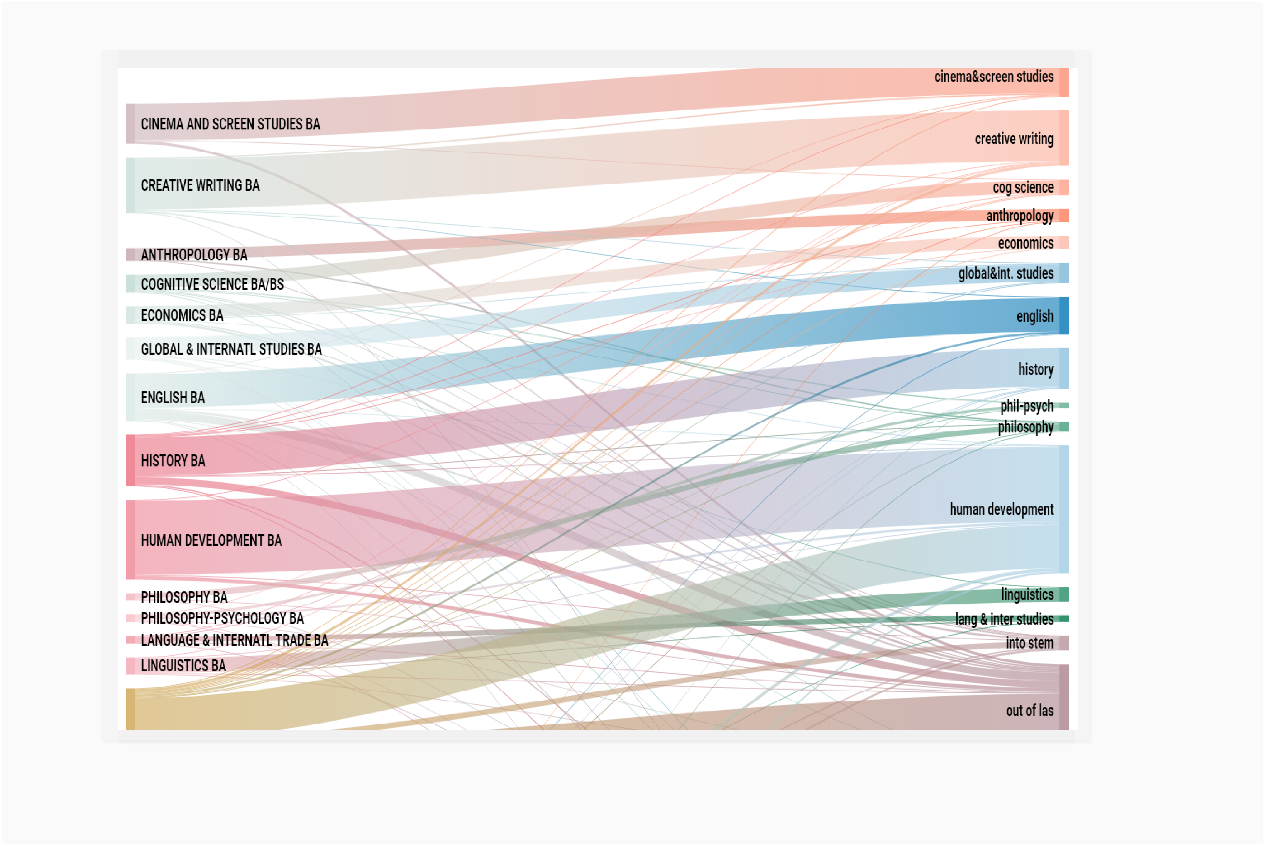
Studying patterns in changes of major is important for resource allocation and planning of advisement and mentoring programs. We specifically analyzed students who were enrolled in Spring 2017 with a look back at their original major.
Challenge & Solution
The data was presented using basic excel graphs, so we determined that the amount of data gathered for this project required rapid visualization. The construction of Sankey diagrams using personalized Java code and D3.Js was the perfect solution. As a result, during the demonstration of the data, viewers are able to better understand the information.
Data Retrieval
- Information downloaded from Banner using Argos
- First program included a record for every single major change
- Worked with a programmer in CTS to create new program that showed one record per student with original major and current major
Sankey Diagram
Illustrate many types of flow, where the width of each flow is based on its quantity.
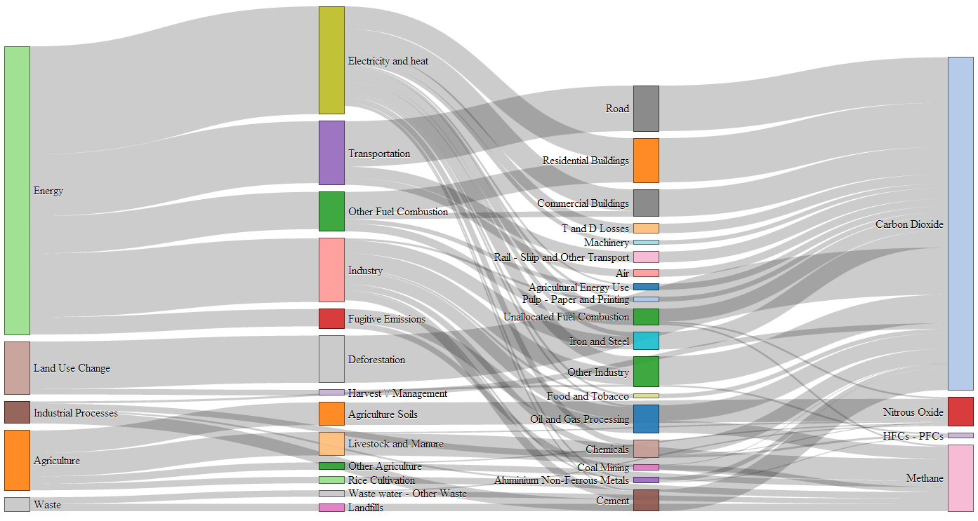 Example from d3.js
Reflection
Click here! for full project.